interior-designer · 6 min
Interior designer photo: show the method, not just the decor
Portfolio, LinkedIn, client proposal: how interior architects and designers can choose a photo that builds trust without looking like a furniture ad.
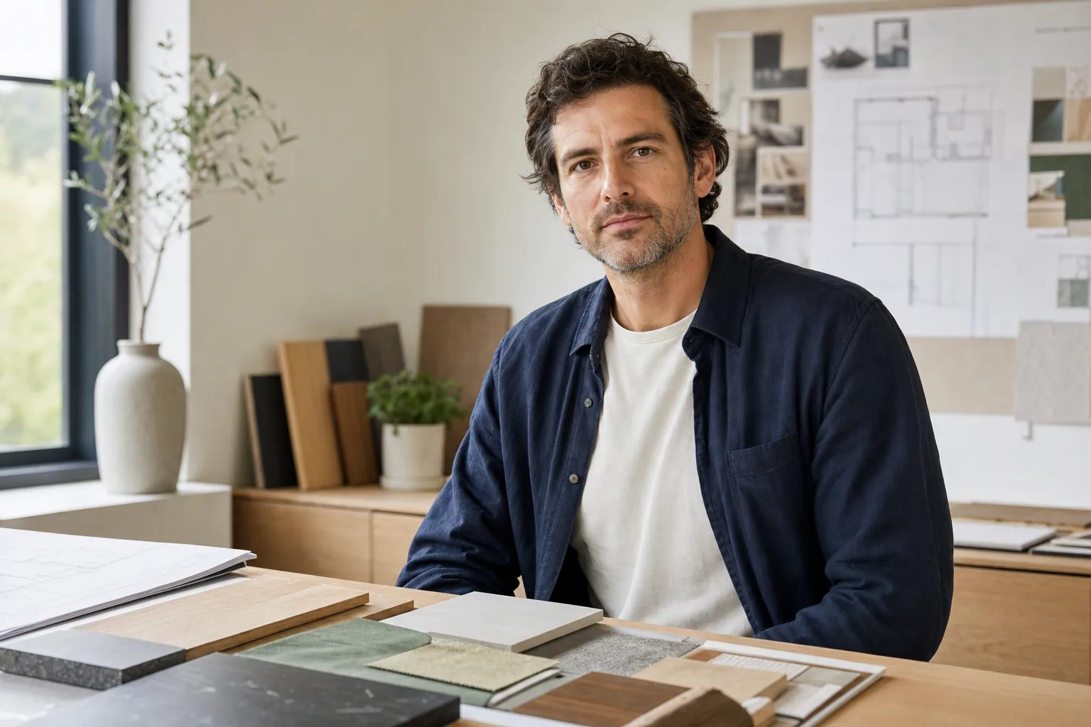
For an interior architect or interior designer, a strong professional photo should do more than show a face. It should explain how you work: client listening, material choices, spatial judgment and presentation discipline. The room should not steal the scene. It should prove the method.
That is the difference between a pretty image and a useful one. A photo that feels too luxurious may attract attention, but it can also create distance. A photo that is too neutral reassures less because it erases the profession. The right portrait connects your face to your project world.
Why does the photo matter so much in a visual profession?
In interior design, clients rarely buy execution alone. They look for someone who will enter a private space, understand concrete constraints and turn vague preferences into visible decisions. Before the first call, your photo becomes the first human cue.
LinkedIn frames the profile as a professional landing page and recommends adding a clear, credible photo. For an interior designer, that photo does not live only on LinkedIn: it also appears in a portfolio, an email signature, an about page, a commercial proposal or a partner listing. It becomes a repeated thumbnail, almost like a living logo.
The trap is copying furniture-catalog codes: perfect sofa, golden light, magazine smile. But the client is not only looking for a beautiful room. They need a person who can arbitrate, explain, hold a budget, talk to contractors and defend a coherent line. The photo should therefore show a professional at work, not a model placed inside a decor.
What setting avoids the obvious cliche?
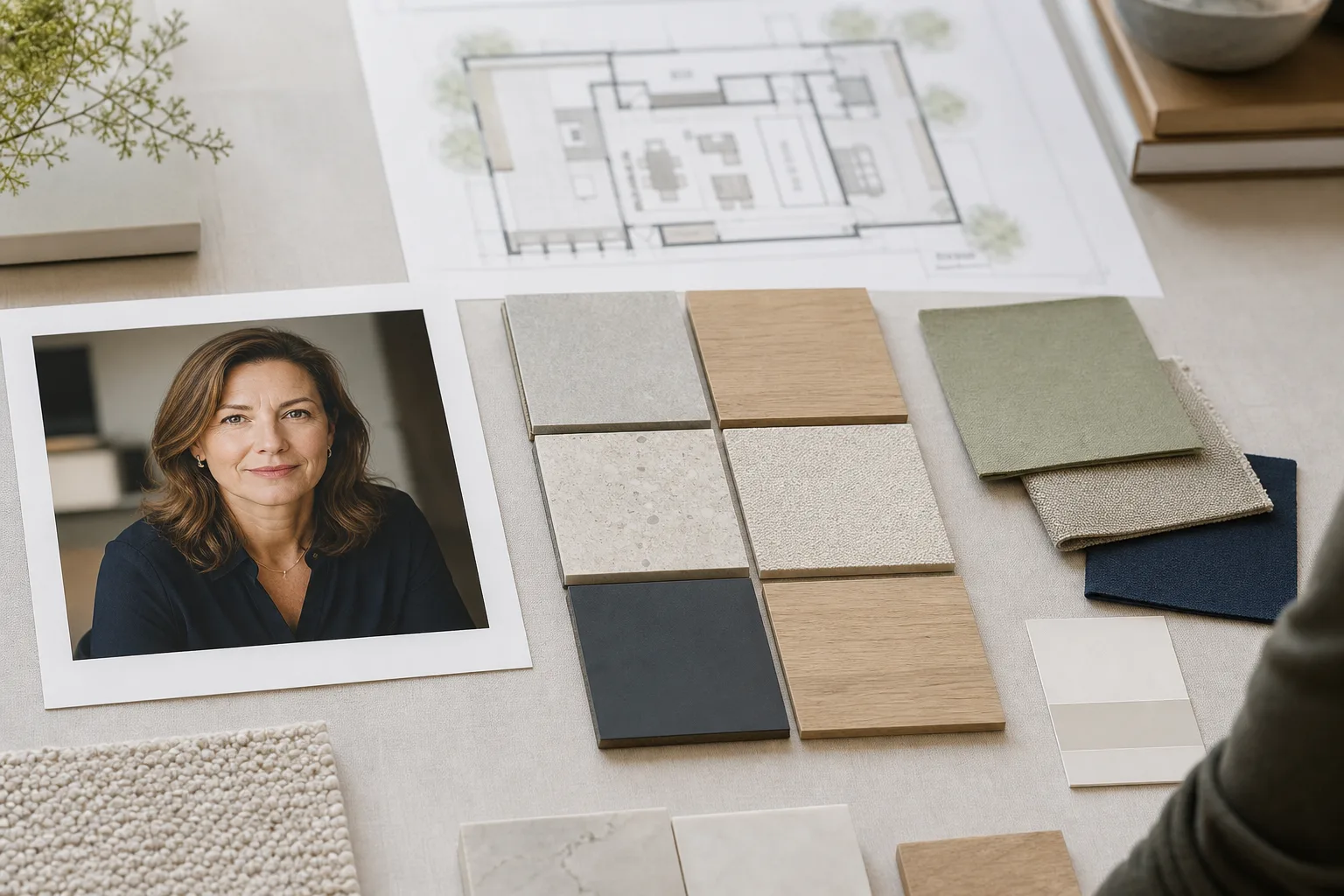
The best setting is often a method setting: material samples, a blurred plan, a notebook, a colour palette, a simple model, a quiet wall, natural window light. These elements tell the job without swallowing the face. They work like anchors in a moodboard: present enough to set the tone, quiet enough to keep the main reading clear.
Avoid three image families. First, the showroom-perfect living room that looks like stock photography. Second, the dramatic construction scene with helmet and vest if that is not your real daily context. Third, the grey corporate portrait that could belong to any consultant. Each extreme weakens the message.
The scene should plausibly exist in your practice: a studio, a work corner, a client presentation table, a material library or a calm space where you could prepare a project. It does not need to look expensive. It needs to feel accurate.
Which visual signals reassure a client?
Three signals do most of the work: readable face, controlled universe, no overacting.
The face stays first. In a mobile thumbnail or a profile list, the client should immediately understand who they are speaking to. Use a head-and-shoulders or chest crop, present gaze, soft light and an open but not salesy expression. The photo should not try to prove your taste before showing that you are identifiable.
The visual universe comes next. A calm palette, real materials and a clean composition send a strong signal: you know how to organise. That matters because your profession is built on organising the visible. If the photo is confused, dark or overloaded, it quietly contradicts your promise.
The third signal is restraint. You do not need a very expensive interior, a dramatic pose or a frozen smile. A simple posture, an outfit aligned with your positioning and a readable setting usually do more than an overproduced advertising image.
How should the photo connect to the portfolio?
The portfolio shows finished projects. Your photo should show the person who makes them possible. If both tell opposite stories, the client feels friction before reading the copy.
Look at your site like a magazine spread. On one side, your projects: volumes, materials, light. On the other, your portrait: posture, colour, energy. If the project page is sober, mineral and precise, but your photo is a yellow cafe selfie, the art direction breaks. Conversely, if your portfolio is warm and approachable but your portrait feels cold and distant, the human promise closes down.
Coherence does not mean uniformity. Your portrait can be more human than your project images. But it should speak the same language: similar colour families, same level of restraint, same attention to detail. Like a well-chosen typeface, it supports the whole without demanding too much attention.
AI photo or real shoot: which should you choose?
If you already have a studio, strong samples and good light, a real shoot is excellent. It anchors your image in your actual environment. But not everyone has a clean studio ready, a photographer available or a recent enough portfolio to organise that immediately.
An AI photo can help if it starts from a recent selfie and remains faithful to your face. It can test a cleaner setting, more professional light or a register more coherent with your positioning. The limit is simple: the result should not invent a status, luxury level or identity that does not match your real activity.
The CNIL warns that generative AI uses require particular care with personal data. A selfie is personal data. A sound approach is to choose a service that explains how it handles images, avoid publishing a result that distorts you, and reject promises that imply there is no risk at all.
FAQ
Should an interior designer smile in their photo?
Yes, if the smile feels natural. A calm half-smile often works better than a very serious face or a sales smile. The client should feel accessible presence, not a forced pose.
Can you pose in front of a client project?
Yes, carefully. Make sure you have permission to use the place and avoid showing recognisable private details. A material table or anonymised project detail is often safer than a full interior.
What outfit works best?
Choose something you could wear to a client meeting: clean, simple and aligned with your world. A shirt, soft jacket, plain knit or sober overshirt usually works better than a look that is too fashion-led or too formal.
Can the same photo work for LinkedIn and a portfolio?
Yes, if it is readable at small size and editorial enough for your site. You can keep the same shot and adapt only the crop for each surface.
Need a portrait that fits your project universe?
Create a professional photo for my portfolio →Sources
Read next.
photo-developpeur-freelance
Freelance developer photo: look credible on GitHub and LinkedIn
GitHub, LinkedIn, portfolio: the right freelance developer photo should signal reliability, clarity, and collaboration, not a staged tech persona.
creative-freelance-photo
Creative freelance photo: signalling your style
AD, motion designer, graphic designer: your photo must show your style without falling into the creative cliché. Method and concrete examples by trade.
lawyer-photo
Lawyer photo: ethics, bar codes and digital
Robe or suit, library or neutral background: what ethics allows for the lawyer profile photo, and what converts on the client side.