creative-freelance-photo · 8 min
Creative freelance photo: signalling your style
AD, motion designer, graphic designer: your photo must show your style without falling into the creative cliché. Method and concrete examples by trade.
I've been an art director and motion designer for ten years. When I see a creative freelance's profile photo, I know in two seconds whether I want to open their portfolio or move to the next. Not because of a technical detail. Because of a global signal: does this person have a style, or did they take the photo everyone takes?
This signal you can work on. Without falling into the cliché of the creative "who plays it up".
The creative freelance photo paradox
A creative freelance sells two things at once: a technical know-how and a gaze. Your profile photo speaks of both. That's what makes the arbitration hard.
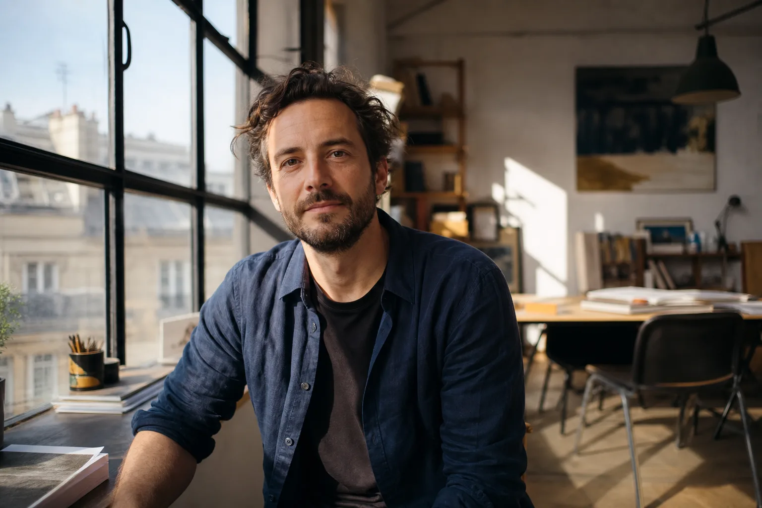
Too classic: we doubt the style
Grey suit, off-white background, adjusted smile. Decent photo, perfectly neutral. For a consultant or a banking cadre, that's what's needed. For a creative freelance, it's a problem: the client wonders why they would pay more than average for someone whose photo teaches them nothing about their visual universe.
Too offbeat: we doubt the pro seriousness
Conversely, the photo in a pink wig in a Berlin loft with blue neon light says: "look how creative I am". The problem is it also says: "I might miss your deadline, and you'll have to manage my ego". Marketing departments briefing freelancers smell this signal at ten metres.
3 axes to signal your style without overplaying
Three levers do 80% of the work. You can pull them independently.
Colour: personal palette, not cliché
Your palette is more effective than your outfit. A burnt ochre background, an ink-blue wall, a golden light — it's a signal that imprints faster than a graphic t-shirt. Pick 2-3 colours that recur in your work.
To avoid: saturated pink-cyan neon (2018 "creative" cliché), black on black (illegible at 80×80), and the Pantone colour of the year that will date your profile.
Light: natural, contrasted, soft
Three options that work for a creative:
- Lateral natural light, window at 90 degrees, soft shadow on one side. Signal: "I work in a real space."
- Softened backlight with bounce. Signal: "I master editorial portrait codes."
- Owned hard light, sharp shadow, pushed contrast. Signal: "I know what I'm doing."
To avoid: the flat front flash, which gives the "corporate ID photo" render.
Framing: rules broken with intent
A slightly decentred framing, leaving a voluntary void next to the face, signals an AD's eye. Same for an unusual format (4:5 vertical, or square with margin). Provided it stays readable: on LinkedIn, your photo is cropped to a circle.
Breaking a rule is OK. Breaking five is chaos.
A client doesn't pay you to be "stylish". They pay you to be "readable" and "intentional".
"Cliché creative" traps
Three recurring traps I see go by every week on Behance and Dribbble.
The neon studio background
Crossed purple/cyan light, saturated shadows on the face, "agency advertising" look. It worked between 2017 and 2021. Today it reads as "trying too hard". If you want neon, keep it for your portfolio, not for your profile photo.
The overplayed pose
Low crossed arms + side gaze + raised eyebrow. Or worse: the hand holding the chin "in reflection". No one thinks like that. It's a pose, and it shows. Better a neutral posture, open shoulders, frontal gaze — the hardest pose, because it doesn't cheat.
Accessories that date
The big black "50s" frame glasses, the indoor beanie, the "I love Helvetica" tee, the ironic Hawaiian shirt. All these accessories have an expiry horizon. When they go out of fashion, your photo ages five years in one season.
Portfolio consistency
The simplest test: open your profile photo and the first page of your portfolio side by side. Would you say it's two different universes?
Profile photo = visual signature of the file
Your photo isn't a separate element. It's the first visual of a continuous presentation file. If your portfolio breathes ochre, cream and ink, your photo must draw from this palette. Not 100% — but at least by touches: a dominant colour in background, or an accent in the outfit.
Mirror colours with the site / Behance / Dribbble
Concretely, open your site, spot the 3 main colours (often: a background, a text, an accent), and reproduce this logic in your photo. The visitor follows a visual journey: site → photo → portfolio. If everything is aligned, they feel intent. If everything is misaligned, they feel amateur.
Cases by creative trade
Codes change by speciality. Four archetypes I encounter monthly.
Art director
The AD sells judgement, not production. Their photo must signal distance, visual culture and framing mastery. Medium framing, direct gaze, worked background (texture, shadow, or dense colour), minimalist outfit — fabric quality matters more than fashion cut. No visual gadget.
Motion designer
Motion sells movement, but their photo is necessarily static. Compensate with light: clearly directional lighting, creating dynamics. More modern outfit (visible sneakers if wide shot, sober graphic tee), background that can be a subtle gradient or saturated colour. The motion designer owns more colour than an AD.
Print / editorial graphic designer
Typo, paper, layout universe. Black and white photo works very well — signals sensitivity to contrasts and grain. If colour, tight palette: cream, ink, one accent. The photo must have an "almost editorial magazine printable" character.
Illustrator
Special case: the illustrator can afford a more "character" photo. They sell a universe, not an interchangeable skill. A photo in their studio, with references on the wall, their work outfit, works better than a neutral studio. Beware still of "too posed".
| Trade | Framing | Background | Outfit | Main risk |
|---|---|---|---|---|
| AD | Chest shot, rather centred | Textured or dense colour | Minimalist, fabric quality | Too neutral, "consultant" |
| Motion designer | Medium shot, margin | Gradient or saturated colour | Modern, sneakers OK | Over-saturation, neon cliché |
| Print graphic designer | Tight shot, B&W OK | Matte, paper, texture | Sober, timeless | Too austere, "printer" |
| Illustrator | Wide shot possible | Workshop, references | Owned work attire | Too posed, "character" |
Generate 10 variations in 5 minutes with AI
The real bottleneck for a creative freelance isn't lack of ideas. It's the cost and time of a studio session when you want to test several visual directions.
Before paying €300 to €600 for a session for one direction, you can iterate upstream. You upload a selfie, play on three parameters (background, outfit, light atmosphere), and get ten variations in a few minutes. You identify the one resonating most with your portfolio. Then two options: you use it directly, or you brief a photographer with a clear reference — which reduces your studio session to 20 minutes instead of 90.
Limits to know: skin texture can be over-smoothed on some generations, likeness varies between attempts, and a very specific background (your real studio, for example) remains impossible to reproduce. For 80% of cases — worked neutral background, controlled light, editorial outfit — it's usable as is.
Prêt à essayer ?
Test 10 styles for free →To go further
A few useful resources if you want to dig:
- Optimise your freelance LinkedIn profile — 5 concrete tips (technical dimensions, banner, pinned portfolio)
- Finding clients as a freelance (importance of a portfolio consistent with your image)
- Freelance photographer: finding clients (visual positioning logic applicable to any image trade)
The profile photo isn't a detail settled in five minutes once every three years. It's a positioning asset, just like your site and your portfolio. You can treat it as such: test, measure responses, iterate. AI makes this iteration cycle possible without losing a month's revenue.
Read next.
photo-developpeur-freelance
Freelance developer photo: look credible on GitHub and LinkedIn
GitHub, LinkedIn, portfolio: the right freelance developer photo should signal reliability, clarity, and collaboration, not a staged tech persona.
interior-designer
Interior designer photo: show the method, not just the decor
Portfolio, LinkedIn, client proposal: how interior architects and designers can choose a photo that builds trust without looking like a furniture ad.
lawyer-photo
Lawyer photo: ethics, bar codes and digital
Robe or suit, library or neutral background: what ethics allows for the lawyer profile photo, and what converts on the client side.