photo-background · 9 min
Professional photo background: white, grey, blurred or coloured?
The background changes how your photo is read more than the outfit does. Guide to picking between white, grey, blurred office or colour depending on your line of work.
You look at a profile photo. Before even reading the name, your brain has already classified the person. What triggered the classification isn't the outfit. It's the background.
A professional portrait's background does two things at once: it isolates the face and it sends a sector signal. A plain grey background doesn't carry the same weight as a blurred open space or a bright orange wall. Choosing at random means letting that signal head in a direction you haven't validated.
Why the background matters more than you think
Visual consistency and recall
When you scroll LinkedIn, your eye processes each thumbnail in a fraction of a second. The face is small, sometimes 80 × 80 pixels on mobile. At that size, the detail of the outfit disappears. What stays readable: the silhouette, the framing, and the coloured mass behind the head.
A background that fits your sector acts as a marker. The recruiter's (or client's) brain files your thumbnail into the right bucket before you've said a word.
The background as a sector signal
A lawyer on dark grey, a consultant on light grey, a developer on a soft blurred light-wood background, an art director on Klein blue: each pairing tells a story of belonging. According to Paris-based corporate photographer Aurélie Blanche, the choice of background must reflect the person's brand and visual identity, not just "look nice".
The 4 background types used in professional portraits
Four families of professional photo backgrounds dominate corporate portraiture.
Pure white: maximum neutrality
White absorbs everything. No message of its own, so no possible mistake. It's the default background of company directories, institutional photos, e-commerce sites and trade listings.
Advantages: universal, bright, puts the face forward. White backgrounds evoke the world of luxury and e-commerce according to feedback from corporate photographers.
Limits: a bit cold, can feel "passport photo" if the lighting is flat. On a feed saturated with white thumbnails, your photo doesn't stand out.
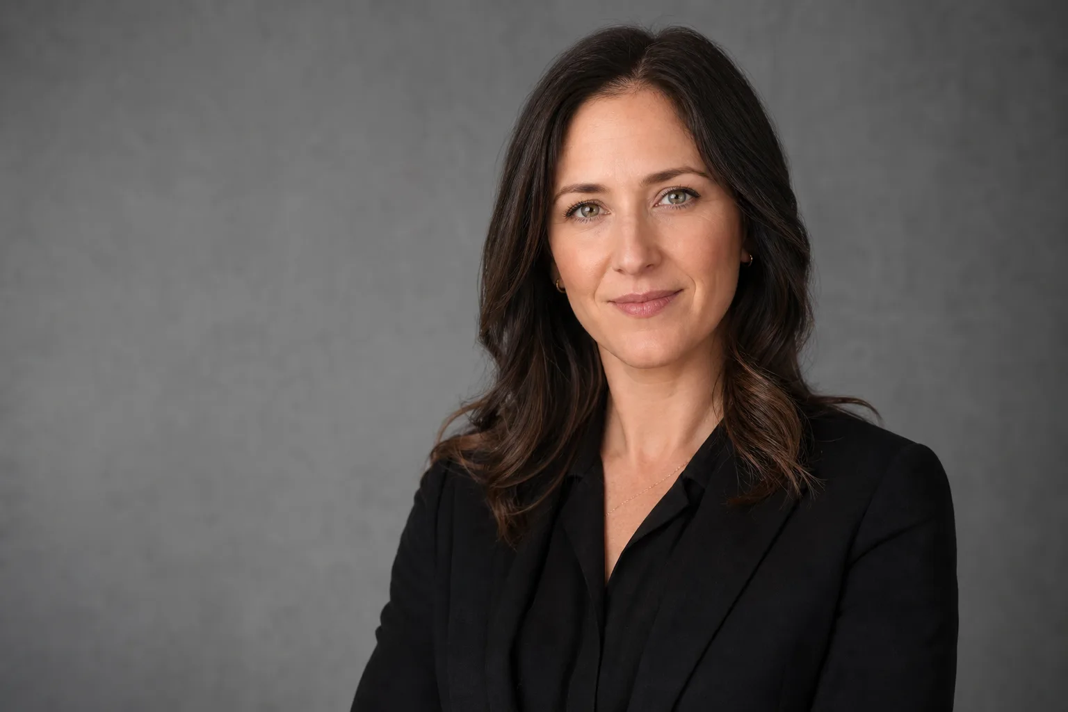
Gradient grey: the corporate safe bet
Grey is the most-used background in corporate portraiture. It's less contrasting than pure white, so softer on the face. A light grey suits almost every profession.
Dark (anthracite) grey adds a layer of authority without falling into the severity of black. It's the compromise you find on consulting-firm partners, mid-level executives and senior consultants.
Black: authority, elegance, senior expertise
A black background evokes cinema and the dramatic. It works for roles where you want to signal recognised expertise, established authority, or a luxury universe.
Pitfalls: black eats dark hair and dark suits. You need separation lighting (rim light) so the silhouette stands out. Without it, the head seems to float. Badly executed black does more harm than a decent grey.
Avoid for: a first job, a career change, a junior role, or any sector where the posture is more collaborative than authoritarian.
Blurred office or environment: storytelling
Rather than a solid background, you keep a real environment but blur it on purpose (shallow depth of field). You can tell there's context without the context distracting from the face.
Effect: humanises, anchors in a real profession, signals you're "in the field". Effective for consulting, sales, operations, and anyone wanting to distance themselves from the overly rigid studio portrait.
Limits: if the blur isn't pronounced enough, the background becomes distracting again. A stray Ethernet cable, a team-building poster, a poorly placed photocopier: all of that betrays the intended authenticity and just looks badly executed.
Background colour psychology
Watch out for the trap: "colour psychology" is a marketing playground where many ungrounded claims circulate. What follows is based on the conventions observed by corporate photographers, not on supposed universal truths. Cultural context weighs more than the colour alone.
According to photographer Gabriel Gorgi, navy blue, grey, black and white are associated with trust, credibility and authority in the French professional context. Warm tones (yellow, orange, light green, red) lean more towards warmth, energy and optimism — a more relaxed feel.
Blue: trust and stability
It's the most-present colour on LinkedIn (logical — it's also the platform's colour). A navy or petrol-blue background evokes finance, law, insurance, enterprise tech. Reassuring, professional, low risk.
Green: balance and growth
Sage green or khaki green works well for jobs tied to sustainability, health, food, well-being. Rarer than blue, so more distinctive. Avoid saturated computer-screen greens that look amateur.
Warm colours: energy
Orange, terracotta, ochre. Signal "creative, energetic, approachable". Relevant for communications, editorial, training, coaching. Risk: it ages fast if the palette is poorly calibrated.
Cool colours: reflection
Beyond blue, petrol blue and teal slide toward a more intellectual, calmer reading. It's the territory of consultants, analysts, business lawyers.
The right background doesn't show itself. It makes something felt before the visitor reads a line of your profile.
Choice matrix by profession
| Profession / sector | Recommended background | Alternative | Avoid |
|---|---|---|---|
| Finance, legal, audit | Dark grey, navy blue | Black with controlled lighting | Orange, blurred open space |
| Consulting (strategy, IT, HR) | Light grey, dark grey | Petrol blue | Saturated colours |
| Tech, product, engineering | Light grey, blurred wood office | Sage green, petrol blue | Pure white (too institutional) |
| Marketing, communications | Signature colour (sage, terracotta, navy) | Bright blurred office | Overly rigid corporate black |
| Creative, art direction, motion, design | Bold colour, blurred studio | Textured light grey | Clinical white |
| Executive leadership, CEO | Dark grey, black, navy blue | Blurred bookshelf, dark textured wall | Vivid colours, passport-style white |
| Coaching, training, HR | Warm blurred office, soft terracotta | Light grey | Black, very cold backgrounds |
| Healthcare, paramedic | White, light grey, sage green | Blurred practice | Black, saturated colours |
| Career change (all targets) | Light grey (neutral, readable) | Blurred office of the new sector | Background that recalls the previous job |
This matrix is a starting point, not a dogma. The final criterion remains consistency: your background must align with your outfit, your lighting, and the tone of your sector.
Recurring mistakes
The unowned cluttered background. A visible bookshelf, a plant, a poster, a window behind you: if it's not blurred or framed with intent, it parasites the face. Simple test: zoom your photo to 200%. If your eye leaves the face, the background won.
The saturated colour background. Tomato red, neon yellow, pool cyan. It attracts the eye, sure, but it crushes the skin tone. The face becomes secondary against an overpowering wall. Prefer a medium saturation and a rather desaturated hue.
The background inconsistent with the outfit. Navy suit on a navy background: the jacket merges with the wall. Black dress on a black background: same. You need enough contrast between the silhouette and the background for the subject to stand out.
The dated background. The blue-purple gradients of 2000s mall studios, starry-bokeh backgrounds, forced vintage patterns. If you often see that background on dated CVs, it's because it ages your photo by ten years.
The generic open-space background. Photos taken in a coworking space, computer screen visible, sticky notes behind: it doesn't tell your profession, it tells "I took the photo between two meetings". If you go for blurred office, do it with a real depth of field and a chosen set.
Redoing your background without redoing your photo: possible with AI
You have a photo that works well on the face, but the background betrays you or no longer fits your target sector. Two options.
Option 1: manual retouching. A Photoshop retoucher cleanly cuts you out and places you on the background of your choice. Count €30 to €80 per photo depending on complexity (fine hair, glasses, transparency). The result is good, but it's one-off: if you want to try three different backgrounds, you pay three times.
Option 2: AI generator. You upload a selfie, you choose the background and the outfit, the AI generates a photo consistent with the face. The advantage: you can try light grey, dark grey, navy, blurred office in the same session and keep the one that works. The downside: likeness can vary from one generation to another, and some US AIs host data outside the EU (check hosting and selfie retention).
SelfiePro offers exactly this flow: you pick the background in a gallery, the AI generates, you download. European infrastructure, selfie not stored on our servers, explicit Gemini processing, temporary 90-day HD file. It's an option to consider if you want to iterate quickly without committing €300 of studio.
Before you dive in: take the matrix above, pick two or three candidate backgrounds for your sector, generate the three, and publish the one that your professional network validates.
Prêt à essayer ?
Choose my background in 30 seconds →Read next.
photo-developpeur-freelance
Freelance developer photo: look credible on GitHub and LinkedIn
GitHub, LinkedIn, portfolio: the right freelance developer photo should signal reliability, clarity, and collaboration, not a staged tech persona.
creative-freelance-photo
Creative freelance photo: signalling your style
AD, motion designer, graphic designer: your photo must show your style without falling into the creative cliché. Method and concrete examples by trade.
interior-designer
Interior designer photo: show the method, not just the decor
Portfolio, LinkedIn, client proposal: how interior architects and designers can choose a photo that builds trust without looking like a furniture ad.