team-photo · 11 min
Corporate team photos: avoiding the directory effect
About page, employer brand, leadership: why team photos go wrong and the standardisation protocol that makes them visually converge.
You open the "Our team" page of a corporate site. Twelve faces, twelve moods. The CFO photographed in front of a dark bookshelf, the CTO in a selfie before a blown-out window, the head of marketing in a Harcourt studio pose, the latest hire in a cropped holiday photo. You don't read a team. You read a patchwork.
This directory effect is the most widespread flaw on French corporate websites. It sabotages the employer brand, dilutes the message, and gives the impression that nobody steers the visual consistency. Yet the fix protocol fits in four dimensions and one brief grid.
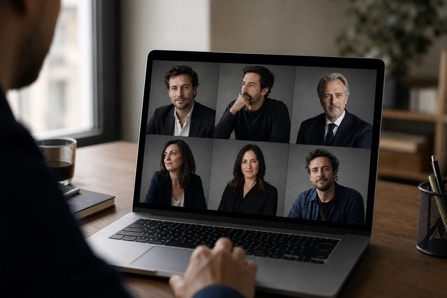
The problem: 12 photos, 12 styles, 0 consistency
The failed corporate directory always follows the same scenario. The founding-team photo was done by a photographer in 2019. The 2021 hires were briefed differently. COVID normalised personal LinkedIn photos imported as-is. The 2024 arrivals got a new session, but with another supplier, in another studio. And the latest three hires have never been photographed: they use their personal profile photo.
Result: a directory that looks like a directionless Pinterest mood board. Each face is fine in isolation. The whole is broken.
Specialist sources put it clearly: Phaos Studio reminds that a corporate photo library must be thought of as a system, not a collection. And MyFairJob, which supports companies on their employer brand, insists on consistency of colours, background and lighting as a prerequisite for a team page that works.
The stakes aren't aesthetic. They're commercial. An inconsistent team page sends three negative signals:
- No art direction: the brand doesn't control its image.
- No visual onboarding process: new hires are left to themselves.
- No attention to detail: extrapolation made by the visitor onto the rest of the company.
For an employer brand trying to attract executives, seniors, candidates approached by five competitors, this signal costs a lot.
The 4 dimensions to standardise
A team page's consistency comes down to four dimensions, and only four. If you secure those four, you get a set that breathes. If you let just one slip, the patchwork returns.
Background
The background is criterion number one. A plain medium-grey background, an off-white background, a light-wood background, a dark gradient: regardless of the chosen colour, what matters is that all 12 portraits share the same background. That's the foundation.
If the corporate studio uses a gradient grey background, all new arrivals must pass before that same backdrop. If the brand has chosen an environmental blurred background (office, workshop), you must reshoot in the same office, at the same focal length, at the same time.
Light
Light controls how the face is read. Hard studio light with marked shadows doesn't mix with soft natural window light. The brief must impose:
- Direction: 3/4 face, 45°, or flat face.
- Quality: soft (large softbox, diffused window) or contrasty (bare umbrella).
- Temperature: tungsten, daylight, or controlled mix.
An uncorrected tungsten/daylight mix gives skins ranging from yellow to blue on the same page. Visually violent.
Framing
Framing = same distance, same height, same head/shoulder proportion. The rule of thirds applies to everyone or no one. If the CEO is framed chest-shot and the head of HR is framed close-up face, the eye sees two different weights, and ranks for no reason.
A working corporate standard: chest shot, eyes at the upper third, shoulders fully visible. Identical side margins.
Expression
Expression = same emotional register. Not the exact same smile, but the same warmth level. An open teeth-bared smile next to a closed neutral face creates imbalance. The brief must decide: light closed smile, measured open smile, or confident neutral. One instruction for everyone.
A consistent team page isn't a page where everyone looks the same. It's a page where no one stands out.
The winning photographer brief
The art direction of a team session is documented. A written brief sent to the photographer, validated before the session, avoids 80% of the deviations.
Here's a template you can copy-paste and adapt.
TEAM PHOTO LIBRARY BRIEF — [COMPANY NAME]

1. Objective
   - Homogeneous photo library for: site About page,
     team LinkedIn, sales materials, press kit.
   - Volume: [N team members] + planned extension
     for 2 years of new hires.

2. Target visual style
   - Reference #1: [URL of a team page we like]
   - Reference #2: [URL of a second reference]
   - Style keyword: clean corporate / editorial /
     environmental / neutral studio

3. Background
   - Type: plain medium-grey gradient (Pantone Cool
     Gray 5) OR environmental blurred 2nd-floor office
   - Subject/background distance: 1.50 m minimum
   - To avoid: pure white, total black,
     visible non-blurred decor elements

4. Light
   - Setup: key light 3/4 face left, 90 cm softbox,
     fill light right -2 stops, optional rim light
   - Temperature: 5500K daylight strict, locked
     white balance
   - No mixing with natural light

5. Framing
   - Plan: chest (top of head at 5% from top of frame,
     cut at mid-torso)
   - Camera height: subject's eye level
   - Focal length: 85 mm equiv 24x36
   - Delivered format: 4:5 portrait + 1:1 square + 3:2 landscape

6. Expression
   - Register: light closed smile, gaze to camera,
     chin slightly down
   - No open laughter, no totally neutral face
   - 3 variations per person: confident neutral, light
     smile, assertive smile

7. Outfit
   - Colour code: neutral tones only (white, black,
     grey, beige, navy). No strong patterns, no visible
     logos from other brands, no garish colours.
   - Top minimum: quality plain t-shirt or shirt/blouse
   - No puffer jacket, hoodie, cap

8. Post-production
   - Skin retouch: light, preserve texture
   - Uniform colour grading applied in batch over the
     whole session
   - Final format: JPEG sRGB 2000 px long side, 300 DPI
     for print

9. Delivery
   - 3 validated variations per person
   - Full-resolution bank kept for re-editing
   - Shared Lightroom LUT/preset to ensure
     consistency of future sessions

10. Future consistency
    - The Lightroom preset of this session will serve as
      reference for all future portraits, whether shot
      by you or another supplier.
This brief seems long. It takes 20 minutes to fill in and saves days of refresh three years later.
Preparing the team members
The best photographer brief is useless if the team members arrive in Coca-Cola logo t-shirts, unshaven, or with bedhead hair.
Send a memo 48 hours before the session. Five points, no more:
- Outfit: reminder of the colour code, photo examples of "yes / no".
- Hair: clean, no exceptional hairstyle for the occasion (the mismatch with daily life breaks authenticity).
- Accessories: glasses accepted if worn daily, remove overly visible watches/necklaces/earrings.
- Face prep: hydrate skin the day before, avoid alcohol the night before (puffy eyes).
- Schedule: individual 10-minute slots, punctuality critical to avoid losing the light setup.
This memo wins 15% portrait success without changing anything about the photographer.
The new-hire headache
Here's the real trap. You did a flawless studio session in March. In October, you hire three people. In January, two more. In April, another.
You have two classic options, both bad:
Option A: annual full reshoot. You bring 50 people back to the studio, redo everything. Cost: €3,000 to €8,000 per session, half-day to full day lost per person, scheduling nightmare for executive calendars.
Option B: individual reshoot of new hires. You pay €150 to €300 per new photo. Except the initial photographer is no longer available, the studio has changed, the light isn't exactly the same. New arrivals come out visibly different. The directory splits again.
This is exactly where AI photos change the equation. Not as a replacement for the founding session (which remains essential to fix the style), but as a bridge for new hires between two big sessions.
Prêt à essayer ?
Standardise a team photo with AI →AI solution: standardising without redoing the whole session
The principle is simple. The new hire takes a standard selfie with their smartphone. The AI generates a portrait in the same style as the other team members: same background, same framing, same light, same expression register.
Concretely:
- Background: you calibrate the instruction once (gradient medium grey, plain navy, blurred environment) and apply it to each new pass.
- Framing: 4:5 chest shot, identical for everyone.
- Outfit: the AI wardrobe lets you unify outfits even when the team member sent a selfie in a t-shirt. You pick a shirt or blazer consistent with the rest of the team's codes.
- Light: direction and quality adjusted in the prompt.
The portrait obtained isn't 100% indistinguishable from a pro studio photo. But it's close enough not to break the whole. On a 200×200 px thumbnail on the team page, the eye doesn't notice.
Honesty: there are limits. Likeness can vary from 70 to 95% depending on the input selfie. AI skin texture is sometimes too smooth compared to a lightly retouched studio portrait. For large-format photos (printed press kit, event banner), the AI photo remains below a pro portrait. For the web team page, team LinkedIn or sales carousel, it's largely enough.
The right arbitration: studio session every 2-3 years to set the codes, AI as bridge for arrivals between two sessions. Not the other way around.
Reverse case: when visual diversity is a deliberate choice
Not everything is systematic. Some brands consciously choose visual diversity in their team page. It's legitimate in three specific cases.
Creative agency or independent studio. An ultra-uniform team page sends a corporate signal that can be counterproductive for a brand selling creativity. Visual diversity itself becomes a message: "we each have our own style, we're different, that's our strength."
Distributed network. For a network of independent agents (real estate, brokerage, freelance) where each member carries their own local brand, standardisation can feel artificial.
NGO or activist collective. A naturalist requirement can impose the selfie or amateur photo as a political stance.
In these cases, visual standardisation isn't the goal, but then you need something else: an editorial frame (presentation texts built on the same template), a rigorous layout grid, identical proportions. Consistency shifts from visual to structural.
For 90% of classic B2B and B2C companies, the choice remains visual standardisation. The broken directory isn't a stance: it's just a lack of art direction.
What to take away
The team page is one of the three or four most-visited pages of a corporate site. It's often the second after the home for a candidate, and the first for a partner who wants to know who they're dealing with. It deserves an art direction investment in proportion.
The protocol comes down to five points:
- Four dimensions to standardise: background, light, framing, expression.
- A written photographer brief that documents each dimension measurably.
- A team member memo 48 hours before the session.
- A founding studio session every 2-3 years to set the codes.
- AI as bridge for arrivals between two sessions, provided you've calibrated the instructions (background, framing, outfit, register).
Trap to avoid: letting each new arrival upload their personal LinkedIn photo because "we don't have time to redo everything". That's exactly how the patchwork is born. A light protocol, applied to every arrival, is worth a thousand times a big annual reshoot that never happens.
Read next.
photo-developpeur-freelance
Freelance developer photo: look credible on GitHub and LinkedIn
GitHub, LinkedIn, portfolio: the right freelance developer photo should signal reliability, clarity, and collaboration, not a staged tech persona.
creative-freelance-photo
Creative freelance photo: signalling your style
AD, motion designer, graphic designer: your photo must show your style without falling into the creative cliché. Method and concrete examples by trade.
interior-designer
Interior designer photo: show the method, not just the decor
Portfolio, LinkedIn, client proposal: how interior architects and designers can choose a photo that builds trust without looking like a furniture ad.