content-creator-photo · 9 min
Content creator and podcaster photo: beyond the selfie
Podcast cover, YouTube thumbnail, pro social profile, press kit: the content creator photo structured by surface to switch to pro mode.
An amateur creator publishes. A pro creator signs. And the signature starts with a photo. The moment you go from a rushed selfie to a coherent visual everywhere is also the moment sponsors arrive, the press writes to you, the audience accepts to pay.
The trap: you have four visual surfaces to hold, not one. Podcast cover, YouTube thumbnail, pro social profile, press kit. Each has its technical constraints, its codes, its objective. And consistency across the four makes all the difference between a creator who's "searching themselves" and a creator a brand can sponsor without hesitation.
The switch to pro mode: sponsors arrive, photo must follow
The tipping signal is rarely glorious. A brand contacts you for a partnership. You send them your "press kit". You realise your press kit is three Instagram screenshots and a holiday selfie. Credibility drops before the first sentence.
At this stage, your photo is no longer a personal detail. It's a business asset. It appears on your Spotify cover, on the thumbnails that make or don't make your audience click, on the decks you send to ad agencies, on your Wikipedia entry if you have one, and on the articles that cite you. A single photo doesn't cover everything. But the absence of a coherent visual system costs you opportunities.
The golden rule: a pro creator has one recognisable face, declined in three to five variants, usable across all surfaces without breaking the identity.
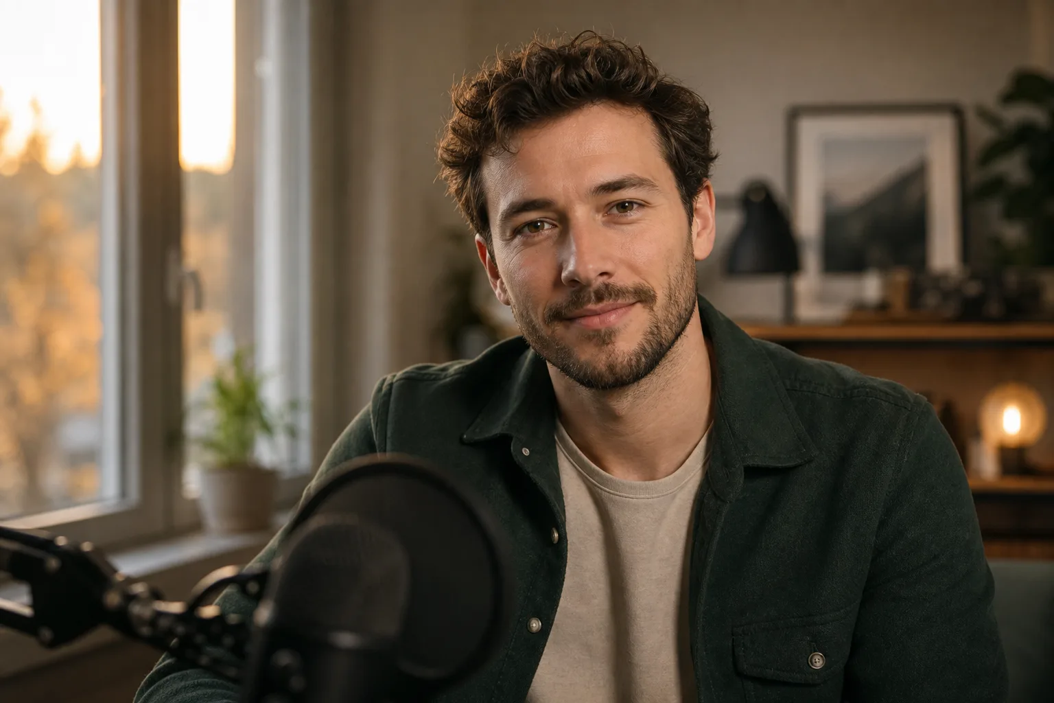
Podcast cover: the photo that stops the scroll
The podcast cover isn't a classic thumbnail. It displays as a square, often shrunk to 55 × 55 pixels in Apple Podcasts or Spotify app lists. If your face is too small, too far, or drowned in the decor, no one stops.
Technical specs to respect:
- Apple Podcasts: minimum 1400 × 1400 px, up to 3000 × 3000 px, JPEG or PNG, RGB
- Spotify: 3000 × 3000 px recommended, JPEG or PNG
- Strict square format, never rectangular
Three cover schools exist. The photo alone on a plain background, the face in close-up with a title over it, and the logo visual without a face. For a podcast carried by an identified creator (your name in the title, your expertise as angle), the close-up face wins almost always. Proof: look at the top 50 business podcasts on Apple Podcasts FR, count the covers with and without faces. The ratio speaks for itself.
The framing that works: shoulders visible, frontal gaze, directional light that creates contrast, plain background that contrasts with the title. Avoid busy backgrounds, heavy filters, and "podcast bro" effects (foreground blurred mic, forced headphones on the ears). The mic tells the story you do a podcast, but it steals the visual space your face should occupy.
YouTube thumbnail: expression vs neutrality?
YouTube isn't LinkedIn. The "neutral, closed smile" rule that works on a corporate profile kills your CTR on YouTube. Thumbnails that perform on the platform share three traits: marked expression (surprise, joy, intensity), high contrast, short readable text at 200 × 113 px (mobile display size).
Technical specs:
- Format: 1280 × 720 px minimum, 16:9 ratio
- Weight: 2 MB max
- File format: JPG, GIF, PNG
- Text readable even at 200 px wide
The trap of the creator going pro: wanting all at once to "look serious" and neutralise thumbnails. Result, the CTR collapses. The right strategy keeps a dynamic expression while raising technical quality. Clean light, controlled framing, palette consistent with your brand, but an expression that calls for a click.
For the pro transition, the right trade-off: two versions of you in stock. An "expressive" version for content thumbnails, a "composed" version for cross-platform appearances (interview, guest podcast, intro slide). You don't have to choose one or the other. You have to use them in the right place.
Pro social profile: Instagram, X, Threads, TikTok
On social networks, your profile photo displays as a 110 × 110 px circle on Instagram, 200 × 200 px on X, and even smaller on TikTok in the feed. Framing must be designed for the circular crop from capture: face centred, comfortable margin around, no cut chin or overflowing hair.
Constraints by platform:
| Platform | Source size | Final display | Crop format |
|---|---|---|---|
| 320 × 320 px min | 110 × 110 px (mobile) | Circle | |
| X / Twitter | 400 × 400 px min | 200 × 200 px | Circle |
| Threads | 400 × 400 px min | Inherits from Instagram | Circle |
| TikTok | 200 × 200 px min | 100 × 100 px (feed) | Circle |
| 400 × 400 px min | 152 × 152 px (desktop) | Circle |
The pro reflex: the same profile photo on all platforms. Not a "cool" Instagram photo, a "pro" LinkedIn photo, an "ironic" X photo. Just one. It's this uniqueness that makes your audience recognise you when you appear in a Repost story, a retweet, a TikTok recommendation.
This advice holds unless you intentionally segment audiences. A creator who talks finance on LinkedIn and music on Instagram can justify two photos. But it's the exception, not the rule. The memorial cost of having several faces in your audience's mind is high.
Across four different surfaces, your audience must recognise you at first glance without reading your name.
Photo for press kit and sponsor file
The press kit is the most-neglected surface by creators going pro. And it's also the one that pays the most, because it determines whether a journalist illustrates you in an article, whether a brand validates you in a sponsor brief, whether an event accepts you as a speaker.
The minimum press kit must contain:
- A high-definition headshot (3000 × 4500 px minimum, 300 dpi) neutral background, frontal gaze, composed expression
- A "lifestyle" photo in your work environment (podcast studio, office, shooting room)
- An "action" photo showing you creating (in front of the mic, behind the camera)
- Horizontal AND vertical versions for each (print press vs social)
- JPEG format, sRGB colour space
- Clear usage rights ("royalty-free for editorial use with credit")
The classic mistake: sending an 800 px wide Instagram crop to a journalist who needs 4000 px for their cover. The journalist doesn't get back to you, picks someone else, and you don't appear in the article.
Prêt à essayer ?
Create my creator photo →The special case of the "no face cam" creator
Not all creators show their face. Faceless YouTube channels, anonymous podcasts, VTuber streamers: anonymity has become a viable strategy. But going pro raises the question differently.
As long as you return only to content production, you can hold without a face. As soon as sponsors enter the equation, a brand wants to invite you to an event, a media wants to cite you, anonymity becomes a wall. Very few brands sign a €5,000 contract with an avatar.
Two solutions exist to go pro without breaking your positioning. First option: an illustrated visual or a high-quality 3D avatar that represents you, declined across all your surfaces. Costly but consistent. Second option: a photo of you from behind, in profile, or with a light graphic mask, signalling "real person" without revealing your face. Creator Corridor Crew, anonymous-version Lex Fridman podcast, or some finance X accounts use this approach.
If you pick an AI avatar for your no-face-cam branding, consistency becomes even more critical. An avatar that changes expression and palette every week builds no visual memory.
Consistency vs renewal
Once your visual system is set, the question becomes: how often do I refresh it?
Too often, your audience loses its bearings and you seem unstable. Too rarely, you age on your own surfaces and send the signal of a creator no longer minding their channel. The practical rule for a creator in pro mode:
- Social profile photo: refresh every 18 to 24 months, or at a major positioning change
- Podcast cover: refresh each season or every year if continuous production
- YouTube thumbnails: no "refresh" but a style consistency to hold over 12 consecutive videos
- Press kit: annual refresh, plus an ad-hoc update if your shooting decor changes
The simple test to know if your photo has had its day: open your four latest publications side by side with your profile photo. If the photo no longer looks like what you produce today (atmosphere, palette, quality level), it's time.
The AI photo changes the economic equation on this point. Bringing in a photographer twice a year to update a multi-surface visual system costs €1,200 to €2,400 annually. Generating several coherent variants online lets you test, iterate, and keep your photo in phase with what you produce without breaking your budget. The limit: AI photos remain less faithful than a studio shoot on skin texture and fine likeness. For the first photo that sets your identity, the studio keeps an advantage. For variants and intermediate refreshes, AI has become the right tool.
You don't need four different photos. You need one coherent face declined across four surfaces. It's this discipline that separates an amateur creator from a creator brands sign.
Read next.
photo-developpeur-freelance
Freelance developer photo: look credible on GitHub and LinkedIn
GitHub, LinkedIn, portfolio: the right freelance developer photo should signal reliability, clarity, and collaboration, not a staged tech persona.
creative-freelance-photo
Creative freelance photo: signalling your style
AD, motion designer, graphic designer: your photo must show your style without falling into the creative cliché. Method and concrete examples by trade.
interior-designer
Interior designer photo: show the method, not just the decor
Portfolio, LinkedIn, client proposal: how interior architects and designers can choose a photo that builds trust without looking like a furniture ad.