linkedin-photo · 10 min
LinkedIn photo 2026: full guide for a pro profile
Framing, background, outfit, expression: the LinkedIn photo that converts in 2026, official sources backed, no outdated stats that still circulate.
Most LinkedIn photo advice you find online sounds alike: "smile", "neutral background", "look at the lens". It's correct, but it doesn't tell you which criterion weighs most when you must trade off. You don't have time to do ten shoots: you must prioritise.
This guide ranks criteria by measured impact and gives, for each trade-off, a clear decision point.
What official LinkedIn figures say
Before tinkering with your photo, look at what LinkedIn itself publishes. The platform has a direct interest in pushing users to complete their profile: the figures it communicates are conservative, not marketing.
2× more views: what it really means
According to LinkedIn's official communications (profile help page), a profile with a photo receives up to 2× more profile views than a profile without. It's the figure LinkedIn highlights today, and it's more modest than the "21×" recycled across dozens of French-speaking blogs without a primary source.
Why this difference with the wild figures circulating? Because blogs reuse stats from an old 2014 LinkedIn study ("21×"), often distorted and taken out of context (limited cohort, unpublished methodology). LinkedIn itself has aligned its official communication on more cautious figures.
What to take away: the photo doubles your chances of being seen. Not 21×, not 9×. But doubling is already huge on a channel where competition is counted in millions of profiles.
3× more connection requests: for whom?
Still according to LinkedIn's official communications, a profile with a photo receives up to 3× more connection requests. The impact plays on two levels:
- The reflex effect: when someone sees your profile in a suggestion, absence of photo is interpreted as "abandoned account" or "suspect profile". The click doesn't even happen.
- The recruiter effect: recruiters often filter their searches via LinkedIn Recruiter to exclude profiles without photos. You simply don't appear in their shortlist.
The 4 criteria that really matter (by order of impact)
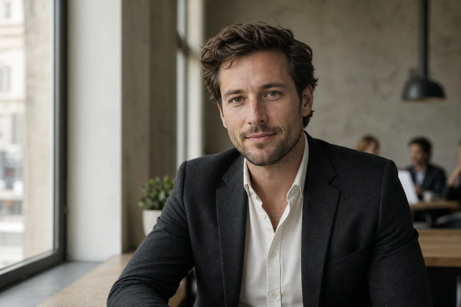
For a converting photo, I rank criteria in this order: framing, background, outfit, expression. It's counter-intuitive (we often think "smile first"), but framing is what makes us stop on your thumbnail at 80×80 pixels.
Framing: rule of thirds and shoulder zone
The ideal LinkedIn framing:
- Eyes located on the upper third of the image (classic photo rule of thirds).
- Shoulders visible, but no lower than the start of the chest.
- Head horizontally centred, with slight space above the hair (10 to 15% of the frame).
Why the shoulders? Because they give an anchor to the face. Without them, your head floats in the void and the brain reads it as "amateur photo". With them, the face is inscribed in a body, therefore in a professional presence.
Background: why plain neutral wins (and when to break it)
The plain neutral background (grey, off-white, beige) is the safe bet in 80% of cases. Simple reason: it puts the face at the centre without distraction. On an 80×80 thumbnail, a busy background becomes visual noise and drowns the subject.
When to break the rule?
- If your trade sells an atmosphere (architect, restaurateur, artisan). A workshop or site background tells expertise.
- If you target a creative sector (art direction, graphic, motion design). A coloured or textured background signals your playground.
- If you're a leader and your office has character (Paris view, library, archive wall). The background becomes an authority signal.
In all other cases, plain neutral. You can also opt for blurred office: an open space or urban landscape background blurred (bokeh effect) stays neutral while signalling "active".
The background changes photo perception more than the outfit. It's the fastest improvement lever and the most underestimated.
Outfit: adapt to the sector, not to fashion
The rule: dress for the role you target, not the one you hold. If you're a manager and target a director role, wear the attire of a director in your sector.
A few benchmarks by sector:
| Sector | Typical outfit | Detail that matters |
|---|---|---|
| Finance, consulting, legal | Dark suit, white or pale blue shirt | Tie optional post-2020, clean neckline |
| Tech, product, engineering | Plain shirt or fine knit over tee | No visible logo, clean colours |
| Marketing, communications | Shirt or blouse, structured jacket | One personal colour, not a total look |
| Executive leadership | Bespoke suit, or jacket without tie | Impeccable cut, matte fabric |
| Creative (art direction, graphic, motion) | Plain shirt, quality tee, merino knit | Owned personal signature |
Avoid: busy patterns (fine stripes, tight checks), which create moiré and artefacts on a compressed thumbnail.
If you lead a marketing team or carry your company's employer brand, your photo becomes a full communication element. Align it with your brand's visual charter (colour codes, posture): your profile will be seen by your candidates, your partners and your competition before your corporate site.
Expression: closed smile vs open smile
Three options, in order of usefulness:
- Kind closed smile: corners of the mouth raised, lips joined, eyes slightly crinkled. It's the "neutral confidence": pro, accessible, not forced. Works in 90% of sectors.
- Open smile (teeth visible): warmer, but riskier. To reserve for trades where human contact is central: sales, HR, coaching, reception.
- Serious expression, direct gaze: authority, senior expertise. For executive profiles, senior finance, business lawyers. Risk: appearing cold or unapproachable.
Simple trick for the closed smile: think of something amusing 2 seconds before the photo, then relax. The eye "smiles" naturally. It's the detail that makes all the difference between "passport photo" and "trust-inspiring photo".
2026 technical specs
LinkedIn applies its own display rules. Not respecting them is delivering a pixelated, badly compressed or cropped photo.
400 × 400 px minimum, JPEG or PNG, 8 MB max
LinkedIn's official technical specs:
- Minimum dimensions: 400 × 400 pixels.
- Recommended dimensions: 800 × 800 pixels (to stay sharp on zoom).
- Accepted formats: JPEG (recommended) or PNG.
- Max file size: 8 MB.
- Ratio: square (1:1).
If you upload smaller than 400 px, LinkedIn auto-upscales (interpolation), and you get a blurry photo. If you upload in low-quality JPEG (aggressive compression), you see artefacts around the face. Aim for 800 × 800 px in JPEG quality 90.
Mobile-first: what LinkedIn displays at 80 × 80 px
The little-known trap: 60% of LinkedIn traffic is on mobile, and the profile photo in the feed displays at 80 × 80 pixels (sometimes 48 × 48 in notifications). At this size, a too-wide photo or a busy background becomes illegible.
The test: take your photo, resize it to 80×80 px (screenshot + zoom out, or online tool), and look. If you clearly distinguish your face and expression, it's good. If it's blurred, start over with tighter framing.
Mistakes that cost views
Mirror selfie, cropped group photo, sunglasses
The three worst mistakes, classic but persistent:
- The mirror selfie: you see the phone, sometimes the flash, the background is an apartment. Immediate "not serious profile" signal. Even an arm-extended selfie is better than a mirror selfie.
- The cropped group photo: you keep your head, but you see someone else's shoulder, or a party background. The brain reads "personal photo, not pro". To avoid even if the photo is flattering.
- Sunglasses: they hide the gaze, therefore human connection. Unless you're a pilot, pro surfer or optician (very rare cases), no sunglasses.
Bonus: no Instagram filters. No artistic blur. No manually added round frame. LinkedIn isn't Tinder.
Photo over 2 years old: the ageing trap
It's the most discreet but also most penalising mistake: a photo that no longer looks like you. If someone meets you in person after seeing a 2018 photo, they feel a mismatch. This mismatch triggers, subconsciously, a loss of trust.
The rule: update your photo every 18 to 24 months, or as soon as you significantly change (haircut, glasses, visible weight gain/loss, marked ageing).
Should you go to a photographer, an app or AI?
Three options today, each with its logic.
The pro photographer (€150-400 for a portrait session in Paris). What you buy: the eye of a pro who directs the pose, calibrated light, professional retouching. Unbeatable for likeness and skin texture. Drawback: 1 to 2 weeks delay, and if you don't like the result, too bad.
Retouching apps (Lightroom mobile, Snapseed, Facetune). You start from a selfie and correct. Cheap, immediate, but you inherit the selfie's defects (average framing, domestic light, busy background). To reserve for minor adjustments on an already decent photo.
AI generators (SelfiePro and others). You upload a selfie, the AI rebuilds a complete pro portrait with background, outfit and studio light. Cost: €0 to €40 depending on service. Delay: 30 seconds to a few minutes. Honest limits: skin texture can appear smoothed, and likeness varies between services. Always verify on a few tests before paying. On the SelfiePro side, the selfie is never stored (memory transit only) and the whole pipeline runs on Europe-hosted servers, a rare differentiation point on this market dominated by US tools.
The right trade-off depending on your case:
- You target a senior leadership role where every detail counts: pro photographer.
- You're in career change or want to test several looks (consultant, manager, creative): AI, to iterate without committing €300.
- You already have a good recent photo but the background is ugly: retouching or AI (regenerating the background only).
Prêt à essayer ?
Generate my LinkedIn photo in 30 seconds →Final checklist before publication
Before clicking "Update photo", run this list:
- The photo is less than 2 years old.
- Framing head + shoulders, eyes on the upper third.
- Neutral background or consistent with your trade.
- Outfit suited to the sector you target.
- Expression: kind closed smile or direct gaze depending on your sector.
- No mirror selfie, no cropped group, no sunglasses.
- Photo 800 × 800 px minimum, JPEG quality 90.
- 80 × 80 px test: you recognise your face and expression.
- Consistency with your CV photo (if you have one).
Once this list is validated, go live. And don't change too often: LinkedIn displays your photo to the same contacts several times a month, visual stability helps memorisation.
Read next.
photo-developpeur-freelance
Freelance developer photo: look credible on GitHub and LinkedIn
GitHub, LinkedIn, portfolio: the right freelance developer photo should signal reliability, clarity, and collaboration, not a staged tech persona.
creative-freelance-photo
Creative freelance photo: signalling your style
AD, motion designer, graphic designer: your photo must show your style without falling into the creative cliché. Method and concrete examples by trade.
interior-designer
Interior designer photo: show the method, not just the decor
Portfolio, LinkedIn, client proposal: how interior architects and designers can choose a photo that builds trust without looking like a furniture ad.