linkedin-photo · 10 min
Pro vs personal photo on LinkedIn: the 2026 border
Hiking selfie, cropped wedding, dog photo: LinkedIn shifts toward authenticity. But how far? The debate settled, sector by sector.
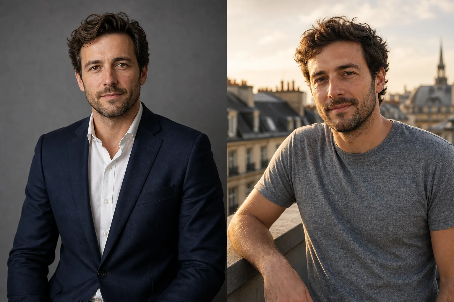
You've seen this post: a leader changing their LinkedIn photo for a t-shirt selfie, sea view behind, relaxed smile. 800 reactions, dozens of comments "finally some authenticity". The next day, another leader publishes their new photo in dark suit, grey background, direct gaze. 600 reactions, comments "this breathes seriousness".
Both work. But not for the same profiles, not in the same sectors, not for the same audiences. The border between "pro" and "personal" photo on LinkedIn isn't a fixed line: it has shifted, and it keeps shifting, by sector.
Here's where it is in 2026.
2020 vs 2026: what has changed on LinkedIn
In 2020, the LinkedIn photo was a stable object. Suit or shirt, neutral background, measured smile, chest framing. One formula, and any deviation passed as amateur.
Six years later, the scene has moved. LinkedIn has become, per Blog du Modérateur, "a hybrid space, where personal stories, political opinions, environmental debates and trade trends mix". The algorithm favours content that generates conversations, not just passive likes. The photo follows this slope: it must serve a narrative, not just a role.
Three forces reshuffled the cards.
First, corporate fatigue. Five years of uniform suits and ties on grey backgrounds have created visual saturation. By standardising everything, profiles merge and no one memorises.
Then, the rise of individual personal branding. On 2026 LinkedIn, you no longer sell only your role, you sell a person with an opinion, a story, a trajectory. The photo must be able to carry this person.
Finally, the generational handover. The 25-35s, who grew up with Instagram, import their codes: natural light, decentred framings, unposed expression. These codes settle even in traditionally formal functions.
The authenticity × seriousness matrix by sector
The right reflex in 2026 isn't "should my photo be authentic or pro" but "where does the border sit in my sector". Three regimes coexist.
Finance, consulting, law: the border hasn't moved
It's the most stable block. Investment banking, Big Four audit, business lawyers, tier 1 consulting firms, wealth management: the 2020 codes still hold in 2026.
Why? Because trust in these trades is bought through the image of rigour. An institutional client trusting you to arbitrate €50 million or an 8-figure procedure doesn't want to see a beach selfie. They want to see someone who masters their emotions, codes, appearance.
What passes:
- Dark suit or tailoring, sober shirt, sober tie or open depending on rank
- Gradient grey background, neutral, or office (woodwork, library) very controlled
- Chest or shoulders framing, direct gaze, closed smile
- Photo taken by a corporate photographer or a very clean AI
What doesn't pass:
- Visible sportswear or casual
- Identifiable outdoor background (terrace, beach, mountain)
- "Hasty" pose or Instagram framing
- Open teeth-bared smile, in most cases
A local exception: "challenger" boutiques positioned against the giants (fintech advisory, new-generation firms). There, a slight relaxation is allowed (open shirt, natural light), but not the selfie.
Tech, SaaS, product: the border has shifted
This is where the transformation is most evident. Product manager, product designer, senior engineer, SaaS founder, head of growth: 2020 codes have become cumbersome.
The suit and tie today signals a mismatch with tech culture. Conversely, the plain t-shirt, the neutral hoodie, the open shirt without jacket have become the professional norm. Not by amateurism, but because it's the real outfit at the office.
What passes in 2026:
- Plain t-shirt, hoodie, open shirt without jacket, polo
- Office background, café, coworking space, even bright interior
- Natural light, window, golden hour
- Open smile, engaged expression
- Framing wider than chest (3/4, full body even for some)
What passes less well than before:
- Full suit and tie, which can signal "old school"
- Classic gradient grey studio, which gives a "2010s HR" feel
- Too-frozen pose, icy gaze
Key trade-off: hold readability without replaying corporate. A t-shirt photo poorly framed, messy kitchen background, remains a bad photo. The code isn't "casual at all costs", it's "controlled casual".
Creative, marketing, media: the border has exploded
Art direction, motion design, creative marketing, journalism, communications, influence: here the photo must sign a style, not just a function. The pro/personal border no longer holds, it's replaced by "consistent with your visual universe" or "inconsistent".
What passes in 2026:
- Coloured outfit, accessories (glasses, cap, marked jewellery) if it's your universe
- Worked background (dominant colour, texture, design interior, workshop)
- Owned framing outside corporate codes (close-up, low angle, intentionally cropped)
- Inhabited expression, possible non-frontal gaze, open laughter
- Owned editorial black and white
What no longer passes:
- Suit and tie, which becomes suspect ("you wouldn't say it's a creative")
- Generic corporate gradient grey studio background
- Neutral pose without intent
For a creative freelance, the photo has become a mini-portfolio. It must signal the taste level even before the person contacts you.
In finance the photo proves rigour. In tech it proves culture. In creative it proves taste. Three trades, three proofs.
5 photos that passed in 2020 and no longer pass
Some formats have become counterproductive, even in formerly conservative sectors.
1. Black suit on black background with hard flash. What signalled "high-end" in 2018 today signals "photo taken 8 years ago" or "outdated corporate file". Replace with soft gradient dark background and controlled light.
2. Cropped photo from a company cocktail. Recognisable by the flash in the eyes, a colleague's cut shoulder, the glass in hand. Reads as "I didn't take the time".
3. Cropped wedding photo. Perfect suit, intact smile, but the context is felt (daylight, off-studio background, guest's posture). Today it shows in two seconds.
4. Commercial smile teeth-bared full-frame. Very 2010s firm catalogue. Today perceived as "generic corporate site photo". Replace with closed smile or natural half-smile.
5. Professional photo over 5 years old. The real-face / photo-face gap has become a strong negative signal. LinkedIn displays profiles in Google searches: a too-visible mismatch loses opportunities even before the first message.
5 photos that didn't pass and now do
Conversely, some formats moved from taboo to norm in several sectors.
1. Outdoor portrait in natural light. Terrace, street, park, open window: acceptable in tech, creative, marketing, HR, communications, training. Still excluded in traditional finance/consulting/law.
2. Open smile teeth visible. Long banned from the French executive, today standard for client, product, creative, training functions.
3. Plain t-shirt without jacket. On a startup founder, a senior PM, a designer: current tech culture signal, not amateurism.
4. Editorial black and white. Long perceived as "too arty", returned in force for functions with strong recognised-expertise component (senior consultants, authors, speakers, established creatives).
5. 3/4 or full-body framing. Chest framing is no longer the only accepted. A 3/4 in motion (slight shoulder twist, visible hand) or even full-body framing pass for functions where the body is expressive (training, conference, creative).
The "three audiences" test: recruiter, client, peer
Before publishing your photo, submit it to three mental gazes. It's the most useful arbitration I've found for borderline cases.
The recruiter is your most conservative audience. They filter quickly, often in parallel with 50 other profiles. Your photo must pass the seriousness filter by the target employer's codes, not yours. If you target a large group, apply the large group's codes. If you target an early-stage startup, the startup codes.
The client judges you on the trust they can grant. The question: "can this person solve my problem?" Their response depends on the type of problem. In B2B finance, they want to see rigour. In B2B tech, lucidity. In B2B creative, taste. The photo must say "I'm made for this problem".
The peer judges you on consistency. They're the one who spots the misstep fastest ("why does he have a banker photo while being a PM?"). Your photo must hold up against 20 other profiles of your trade without standing out negatively.
If the three audiences send a positive signal (even slightly different), you're at the right spot. If one drops off, rework.
AI photo and authenticity: paradox or complement?
The most tense debate of 2026. Can an AI-generated photo be "authentic"?
Short position: yes, under precise conditions.
An AI photo that really looks like you (same traits, same base expression, same age, same build), taken from a recent selfie, isn't more "deceptive" than a studio portrait retouched in Photoshop. Both correct, smooth, adjust. The difference is the tool, not the intent.
An AI photo that transforms you (radically different face, erased age, modified morphology) crosses the line. Your contacts will poorly recognise you in physical meetings, and the mismatch works against you.
The practical rule:
- If you can show the photo to a colleague who didn't know and they say "ah it's you", it's good
- If you hesitate to show it because it no longer looks enough like you, it's too far
AI generators (including SelfiePro) have real limits: sometimes too-smooth skin texture, variable likeness depending on the source selfie, sometimes poorly rendered accessories. These limits attenuate but exist. The test remains the same: photo that looks like you, in a staging that looks like you, signals what you do. Photo that transforms you, signals something else.
2026 verdict: the new border in one sentence
The 2026 LinkedIn photo must pass a simple test: would I wear this outfit, in this context, this morning at work? If yes, regardless if it's a suit or t-shirt, studio or terrace, formal or relaxed. The photo is consistent with your real trade and will pass all filters.
If the photo puts you in an outfit, context or posture you never hold in real life, the border is crossed on the "personal disguised as pro" or "pro disguised as something else" side. And it shows.
The real fault line in 2026 is no longer pro vs personal. It's consistency vs inconsistency. The rest follows.
Prêt à essayer ?
Test the photo matching my sector in 2026 →Sources
Read next.
photo-developpeur-freelance
Freelance developer photo: look credible on GitHub and LinkedIn
GitHub, LinkedIn, portfolio: the right freelance developer photo should signal reliability, clarity, and collaboration, not a staged tech persona.
creative-freelance-photo
Creative freelance photo: signalling your style
AD, motion designer, graphic designer: your photo must show your style without falling into the creative cliché. Method and concrete examples by trade.
interior-designer
Interior designer photo: show the method, not just the decor
Portfolio, LinkedIn, client proposal: how interior architects and designers can choose a photo that builds trust without looking like a furniture ad.